With 6th June marking the 80th anniversary of the Normandy landings, D-Day marks the largest seaborne invasion in history marking the “successful beginning of the end of Hitler's tyrannical regime” described by the US Department of Defense. Today, a series of significant commemorations in the UK and France will honour the impact of the courageous personnel who risked their lives for freedom and peace.
Andipa’s collection includes a range of artworks that explore warfare and military action. From Banksy’s ‘Golf Sale’ (2003) print that depicts three tanks to Warhol’s ‘Camouflage’ series and Lichtenstein’s military-based ‘Explosion’ and ‘Whaam’ each capture and comment on the brutal impact of war through diverse artistic treatments.
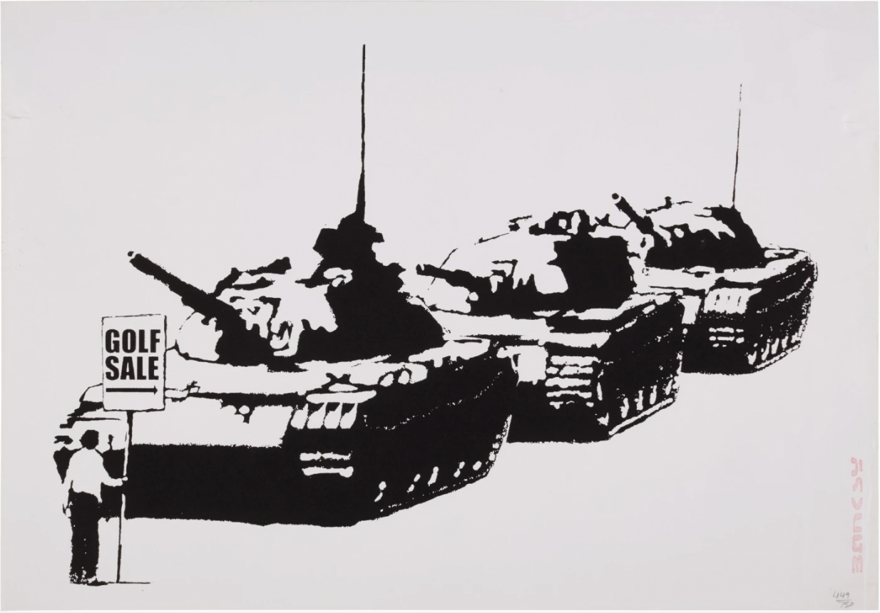
One of the first prints to be released by Banky, Golf Sale was produced in 2003 and is a widely recognised work synonymous with the artist. Based on the iconic photograph Tiananmen Square Tank Man photograph taken by Jeff Widener in 1989. The photograph infamously depicts an anonymous man stood in front of a column of Type 59 tanks to block their path as they attempted to leave Tiananmen Square in Beijing, and has since been internationally recognised as a symbol striving for freedom following the Chinese state’s brutal suppression of protestors involved in the ‘89 Democracy Movement.
Banky’s recreation is characteristically crafted in the artist’s stencil-style, with a dark humour that depicts the protester holding a ‘Golf Sale’ sign more commonly seen across London and city centres. The combination of anti-authoritarian, coupled with a critique of capitalism, as well as the state, imbues the artwork with a distinctive Banksy voice.
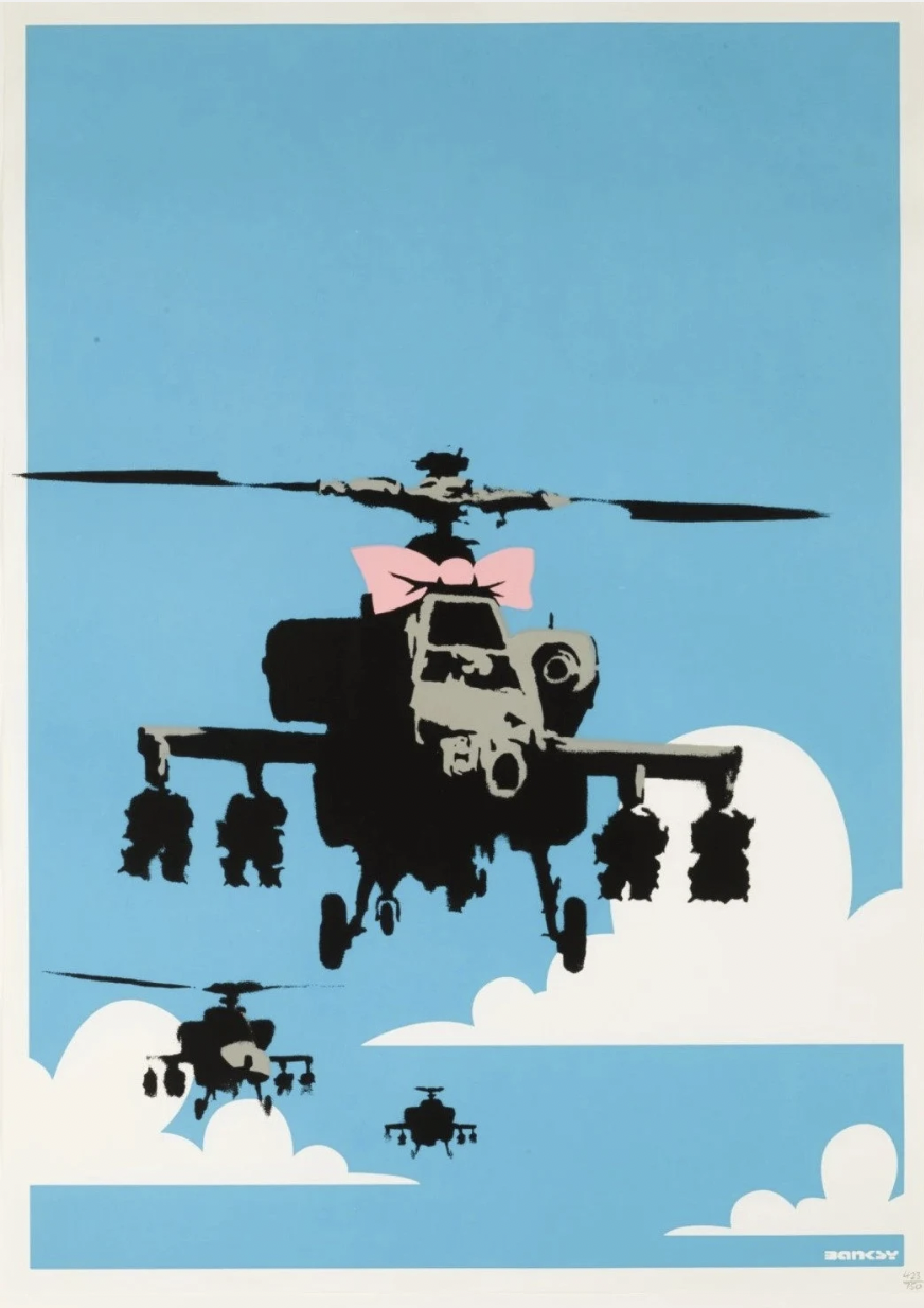
‘Happy Choppers’ was created in 2004 and originally appeared as a street art piece at London’s Whitecross Street market in 2002. A swarm of armed military helicopters (Apaches) fly directly towards the viewer, creating an immediate and urgent impact: perhaps it confronts the viewer about their involvement, or passivity by this startling and confronting presence of military aircraft seemingly travelling towards to us. The presence of a bubblegum-pink bow placed at the centre of the frame foregrounds Banksy’s wry wit. This childish addition perhaps alludes to war as silly, foolish and futile, or possibly comments on the pilots as puppets in this mocking. example It also resembles the ribbons seen with military medals, created a layered ambiguity to the bow’s presence.
Just like the oxymoronic title of the artwork ‘Happy Choppers’, the imagery similarly juxtaposes the menacing might of warfare with a ‘happy’ bow. The cartoonish white clouds evoke candyfloss peaks contrasting to the menacing presence of the helicopters.
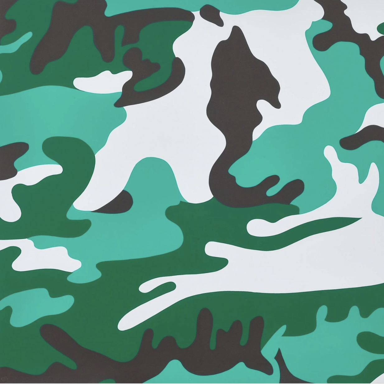
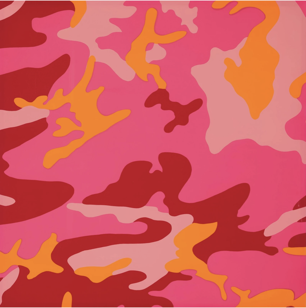
The last print series created by Warhol, Camouflage was created shortly before his death in 1987. The genesis for the design was reportedly ignited by a conversation with his studio assistant at the time, Jay Shriver, who has been developing a process of painting through a mesh of military fabric.
Historically, camouflage military clothing incorporates natural, earthy tones of greens, greys and browns to blend soldiers into their surrounding. Warhol subverts this premise by including bright, bold hues of pinks, reds, blues and oranges to draw, rather than deflect, attention to the surface patterns. The subversion of traditional camouflage hues was perhaps an indication of Warhol’s apathetic stance to war, infamously being ‘politically neutral’. His re-creation of a pattern that typically denotes the heaviness and fearfulness of war through green camouflage tones, is modified to add playfulness and vibrancy to a charged, difficult and menacing military pattern.
Andy Warhol’s own horrific experience of a gunshot wound may have resonated during the treatment of this series. His incorporation of camouflage into his Fright Wig Self Portraits at the end of his life confronts the role of camouflage and blending with his own identity and response to fame.
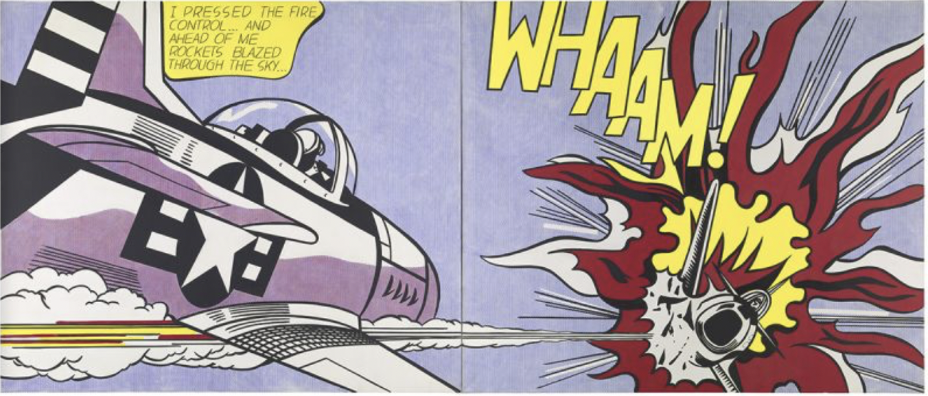
One of the most recognisable Pop art creations, Roy Lichtenstein’s iconic ‘Whaam!’ painting was created in 1963. The left hand panel depicts a slightly tilted fighter plane firing a rocket which hits the second partially visible plane seen in the right hand panel, swallowed in the violent blaze of flames. Lichtenstein’s frequent use of words to create onomatopoeic impact are seen in the capitalised wording of ‘Whaam!’ above.
Lichtenstein adapted the image from several comic book panels - the main source being a panel illustrated by Irv Novick from a 1962 war comic book. Lichtenstein’s own experience serving in the army from 1943-1946 during World War II undoubtedly created a sharper assessment of military life. Lichtenstein depicted aerial combat in several of his works following his basic military training which included aircraft drills, as well as pilot training but the programme cancelled before it was due to begin. After entering training programs for languages, engineering, and piloting, all of which were cancelled, Lichtenstein served as an orderly, draughtsman and artist in non combat roles.
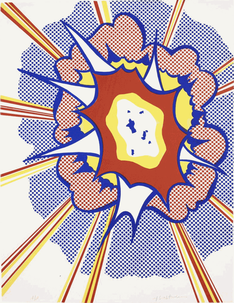
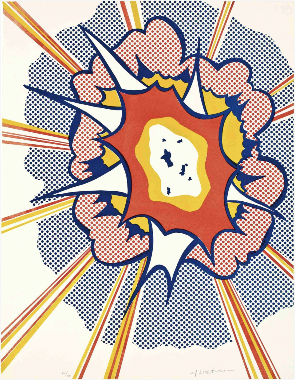
Roy Lichtenstein’s Explosion, made in 1967, is a key work from the Pop artist’s ‘comic-art’ period. From an edition of 100, it is a rare print image. The vivid colours of the cartoon-style captures a more sinister state of warfare; perhaps encapsulating his own experience in the army. In the early 1960s, Lichtenstein’s artworks incorporated images of explosions from popular war comics. This merging of destructive detonation through a cruder, more simplistic cartoon-style rendering with the vibrancy of primary colours arguably desensitises the destruction.
Printer Irwin Hollander described this print as "pure, simple lithography”. The print is cleverly composed of multiple layers: Lichtenstein’s familiar motifs of bold outline borders, Benday dots and solid primary blocks of colour collide to build textured depth in evoking the visual effect of an explosion. The solid bands of colour in the centre illuminate the immediate intensity of the blast, whilst the striped beams of electric-hued lightening-like bolts fork out of the frame, inferring a seemingly limitless scale. Lichtenstein’s signature Benday dots – seen in the farthest two circular layers - were applied with tusche squeegeed through a grid directly onto the plate, which gives the impression of clouds of smoke in the aftermath of the bang. The loose blue specks in the centre are less stylised than his key motifs seen elsewhere, perhaps indicating the debris of the explosion.
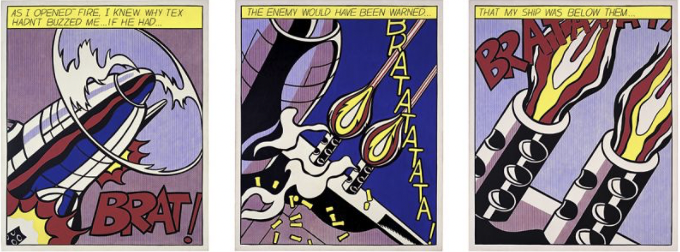
Roy Lichtenstein’s ‘As I Opened Fire’ is a 1964 oil on canvas that features three panelled sections. The inspiration for the triptych was Jerry Grandenetti’s artwork panels in the ‘All American Men of War’ comic book.
Lichtenstein commented on his war imagery: “A minor purpose of my war paintings is to put military aggressiveness in an absurd light. My personal opinion is that much of our foreign policy has been unbelievably terrifying, but this is not what my work is about and I don't want to capitalize on this popular position. My work is more about our American definition of images and visual communication”.
The work flows like a series of “movie clips”. Text at the top of the frames read ‘As I opened fire, I know why Tex hadn’t buzzed me… If he had… the enemy would have been warned… that my ship was below them…’ The narrative of the work has been deemed unclear, lacking a clear narrative progression, with confusion about which frames represent an enemy or ally.
Roy Lichtenstein’s ‘As I Opened Fire’ is a 1964 oil on canvas that features three panelled sections. The inspiration for the triptych was Jerry Grandenetti’s artwork panels in the ‘All American Men of War’ comic book.
The narrative displays text at the top of the panels that reads ‘As I opened fire, I know why Tex hadn’t buzzed me… If he had… the enemy would have been warned… that my ship was below them…’
Lichtenstein commented on his war imagery: “A minor purpose of my war paintings is to put military aggressiveness in an absurd light. My personal opinion is that much of our foreign policy has been unbelievably terrifying, but this is not what my work is about and I don't want to capitalize on this popular position. My work is more about our American definition of images and visual communication”.
The work flows like a series of “movie clips”. The narrative of the work has been deemed unclear, lacking a clear narrative progression, with confusion about which frames represent an enemy or ally.
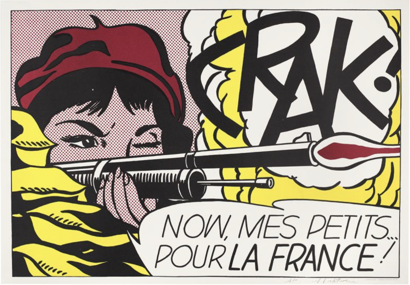
Lichtenstein’s print ‘CRAK!’ was published in 1963 to announce his second solo show at Leo Castelli Gallery and comprises an edition of 300. Featuring his trademark Pop art motifs - Benday dots, primary colours, a speech bubble - the print depicts a woman shooting a rifle, squinting at her target, with the word ‘Crak!’ loudly emblazoned above the rifle. The beret-clad woman’s features are largely concealed - just an arched eyebrow and focused eye above long, slender fingers that curl around the pistol. The print also displays monocular vision, as the woman is depicted with one eye open and the other closed, which is seen elsewhere in Lichtenstein’s art.
For more information on any of the works featured, contact Andipa Editions via sales@andipa.com or call +44(0)20 7589 2371 to explore Banksy prints for sale, original Warhol prints or to buy Roy Lichtenstein prints.